At Makeswift, we focus on creating value in our niche and copy the rest. When we needed a tabs component for our product, Vercel was top of mind. While our tabs component isn't an exact copy the code here aims to be.
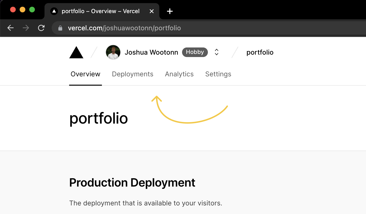
tabs component as seen in the Vercel dashboard for this site
In the article I am going to breakdown how to create this component in CSS, React Transition Group, React-Spring, and Framer Motion.
Here is what we are going for:
CSS
import classNames from "classnames";
import {
  PointerEvent,
  FocusEvent,
  useEffect,
  useRef,
  useState,
  CSSProperties,
} from "react";

type Tab = { label: string; id: string };

type Props = {
  selectedTabIndex: number;
  tabs: Tab[];
  setSelectedTab: (input: number) => void;
};

export const CSSTabs = ({
  tabs,
  selectedTabIndex,
  setSelectedTab,
}: Props): JSX.Element => {
  const [buttonRefs, setButtonRefs] = useState<Array<HTMLButtonElement | null>>(
    []
  );

  useEffect(() => {
    setButtonRefs((prev) => prev.slice(0, tabs.length));
  }, [tabs.length]);

  const [hoveredTabIndex, setHoveredTabIndex] = useState<number | null>(null);
  const [hoveredRect, setHoveredRect] = useState<DOMRect | null>(null);

  const navRef = useRef<HTMLDivElement>(null);
  const navRect = navRef.current?.getBoundingClientRect();

  const selectedRect = buttonRefs[selectedTabIndex]?.getBoundingClientRect();

  const [isInitialHoveredElement, setIsInitialHoveredElement] = useState(true);
  const isInitialRender = useRef(true);

  const onLeaveTabs = () => {
    setIsInitialHoveredElement(true);
    setHoveredTabIndex(null);
  };

  const onEnterTab = (
    e: PointerEvent<HTMLButtonElement> | FocusEvent<HTMLButtonElement>,
    i: number
  ) => {
    if (!e.target || !(e.target instanceof HTMLButtonElement)) return;

    setHoveredTabIndex((prev) => {
      if (prev != null && prev !== i) {
        setIsInitialHoveredElement(false);
      }

      return i;
    });
    setHoveredRect(e.target.getBoundingClientRect());
  };

  const onSelectTab = (i: number) => {
    setSelectedTab(i);
  };

  let hoverStyles: CSSProperties = { opacity: 0 };
  if (navRect && hoveredRect) {
    hoverStyles.transform = `translate3d(${hoveredRect.left - navRect.left}px,${
      hoveredRect.top - navRect.top
    }px,0px)`;
    hoverStyles.width = hoveredRect.width;
    hoverStyles.height = hoveredRect.height;
    hoverStyles.opacity = hoveredTabIndex != null ? 1 : 0;
    hoverStyles.transition = isInitialHoveredElement
      ? `opacity 150ms`
      : `transform 150ms 0ms, opacity 150ms 0ms, width 150ms`;
  }

  let selectStyles: CSSProperties = { opacity: 0 };
  if (navRect && selectedRect) {
    selectStyles.width = selectedRect.width * 0.8;
    selectStyles.transform = `translateX(calc(${
      selectedRect.left - navRect.left
    }px + 10%))`;
    selectStyles.opacity = 1;
    selectStyles.transition = isInitialRender.current
      ? `opacity 150ms 150ms`
      : `transform 150ms 0ms, opacity 150ms 150ms, width 150ms`;

    isInitialRender.current = false;
  }

  return (
    <nav
      ref={navRef}
      className="flex flex-shrink-0 justify-center items-center relative z-0 py-2"
      onPointerLeave={onLeaveTabs}
    >
      {tabs.map((item, i) => {
        return (
          <button
            key={i}
            className={classNames(
              "text-md relative rounded-md flex items-center h-8 px-4 z-20 bg-transparent text-sm text-slate-500 cursor-pointer select-none transition-colors",
              {
                "text-slate-700":
                  hoveredTabIndex === i || selectedTabIndex === i,
              }
            )}
            ref={(el) => (buttonRefs[i] = el)}
            onPointerEnter={(e) => onEnterTab(e, i)}
            onFocus={(e) => onEnterTab(e, i)}
            onClick={() => onSelectTab(i)}
          >
            {item.label}
          </button>
        );
      })}
      <div
        className="absolute z-10 top-0 left-0 rounded-md bg-gray-200 transition-[width]"
        style={hoverStyles}
      />
      <div
        className={"absolute z-10 bottom-0 left-0 h-0.5 bg-slate-500"}
        style={selectStyles}
      />
    </nav>
  );
};
CSS animations are great for understanding things on a first principles basis.
There are some pain points though:
- Tracking the first render
- Manually holding state to animate the exit
and there are
- No terse ways of organizing styles
- No easy ways to animate between content
Tracking the first render
The hover animation animates opacity on pointerEnter and animates opacity,width , and transform as the pointer moves accross tabs.
This requires holding state to toggle the transition property
// state related to `hovered` animation
const [isInitialHoveredElement, setIsInitialHoveredElement] = useState(true)

const onLeaveTabs = () => {
    // reset `isInitialHoveredElement` when the pointer leaves the tabs
    setIsInitialHoveredElement(true)
    setHoveredTabIndex(null)
}

const onEnterTab = (/* ... */) => {
    // ...
    setHoveredTabIndex(prev => {
        // set `isInitialHoveredElement` if the value is being assigned
        // from == null (pointer has entered tabs component)
        if (prev != null && prev !== i) {
            setIsInitialHoveredElement(false)
        }
        return i
    })
    // ...
}
The select animation has a different lifecycle. It animates opacity once refs to the dom have been initialized and animates opacity, width, and transform when selection changes.
Like the hover animation, this requires holding renderCount state to toggle the transition property
// state related to `selection` animation
const isInitialRender = useRef(true)

// since the ref isn't defined on the first render I want the
// selection indicator to animate in with just the opacity
selectStyles.transition = isInitialRender.current
    ? `opacity 150ms 150ms`
    : `transform 150ms 0ms, opacity 150ms 150ms`
Note: You might be wondering why I don't derive ^ state from the truthiness of the refs. That is also an option, but since I have an array of refs to each tab I opted for simplifying it
Manually holding states to animate the exit
I am changing the size of the hovered animation based on the bounding box of the hovered element.
It is imporatant that as the hovered animation disappears it's size doesn't change.
So naturally, size and visibility have to be stored seperately in state.
// storing visibility as the presence of a `hoveredTabIndex`
const [hoveredTabIndex, setHoveredTabIndex] = useState<number | null>(null)
// storing size as a DOMRect
const [hoveredRect, setHoveredRect] = useState<DOMRect | null>(null)
Tracking exit state seperately from size is ok for one element, but this can gunk up components that track an array of elements or toggle between elements.
No terse way of organizing styles
Because JSX doesn't allow statements (only expressions) I am using a let and an if statement to set state and change styles simultaneously.
let selectStyles: CSSProperties = { opacity: 0 }
if (navRect && selectedRect) {
    selectStyles.width = selectedRect.width * 0.8
    selectStyles.transform = `translateX(calc(${
        selectedRect.left - navRect.left
    }px + 10%))`
    selectStyles.opacity = 1
    selectStyles.transition = isInitialRender.current
        ? `opacity 150ms 150ms`
        : `transform 150ms 0ms, opacity 150ms 150ms, width 150ms`

    // setting `isInitialRender` state so that on
    // following renders the transition will be different
    isInitialRender.current = false
}
No easy way to animate between content
Starting with React-Spring, there are animations moving the shapes animating in and out. I didn't try to do that here becuase there isn't an abstraction in CSS for doing it cleanly without causing layout shifts.
React Transition Group
React Transition Group was the first big react animation library. It solves the "Tracking first render" and "Manually holding exit state" problems. And it does so well with a light bundle size.
import classNames from "classnames";
import {
  useEffect,
  useRef,
  useState,
  PointerEvent,
  FocusEvent,
  CSSProperties,
} from "react";
import { Transition } from "react-transition-group";

import { Tab } from "./useTabs";

type Props = {
  selectedTabIndex: number;
  tabs: Tab[];
  setSelectedTab: (input: number) => void;
};

const duration = 300;

const transitionStyles = {
  entering: {
    opacity: 1,
    transition: `transform 0ms, opacity 150ms, width 0ms`,
  },
  entered: {
    opacity: 1,
    transition: `transform 150ms 0ms, opacity 150ms 0ms, width 150ms`,
  },
  exiting: {
    opacity: 0,
    transition: `transform 0ms, opacity 150ms, width 0ms`,
  },
  exited: { opacity: 0 },
  unmounted: {},
};

export const TransitionGroupTabs = ({
  tabs,
  selectedTabIndex,
  setSelectedTab,
}: Props): JSX.Element => {
  const [buttonRefs, setButtonRefs] = useState<Array<HTMLButtonElement | null>>(
    []
  );

  useEffect(() => {
    setButtonRefs((prev) => prev.slice(0, tabs.length));
  }, [tabs.length]);

  const navRef = useRef<HTMLDivElement>(null);
  const navRect = navRef.current?.getBoundingClientRect();

  const [hoveredTabIndex, setHoveredTabIndex] = useState<number | null>(null);
  const [hoveredRect, setHoveredRect] = useState<DOMRect | null>(null);

  const selectedRect = buttonRefs[selectedTabIndex]?.getBoundingClientRect();

  const onLeaveTabs = () => {
    setHoveredTabIndex(null);
  };

  const onEnterTab = (
    e: PointerEvent<HTMLButtonElement> | FocusEvent<HTMLButtonElement>,
    i: number
  ) => {
    if (!e.target || !(e.target instanceof HTMLButtonElement)) return;

    setHoveredTabIndex(i);
    setHoveredRect(e.target.getBoundingClientRect());
  };

  const onSelectTab = (i: number) => {
    setSelectedTab(i);
  };

  const hoverStyles: CSSProperties =
    navRect && hoveredRect
      ? {
          transform: `translate3d(${hoveredRect.left - navRect.left}px,${
            hoveredRect.top - navRect.top
          }px,0px)`,
          width: hoveredRect.width,
          height: hoveredRect.height,
        }
      : {};

  const selectStyles: CSSProperties =
    navRect && selectedRect
      ? {
          width: selectedRect.width * 0.8,
          transform: `translateX(calc(${
            selectedRect.left - navRect.left
          }px + 10%))`,
        }
      : {};

  return (
    <nav
      ref={navRef}
      className="flex flex-shrink-0 justify-center items-center relative z-0 py-2"
      onPointerLeave={onLeaveTabs}
    >
      {tabs.map((item, i) => {
        return (
          <button
            key={i}
            className={classNames(
              "text-md relative rounded-md flex items-center h-8 px-4 z-20 bg-transparent text-sm text-slate-500 cursor-pointer select-none transition-colors",
              {
                "text-slate-700":
                  hoveredTabIndex === i || selectedTabIndex === i,
              }
            )}
            ref={(el) => (buttonRefs[i] = el)}
            onPointerEnter={(e) => onEnterTab(e, i)}
            onFocus={(e) => onEnterTab(e, i)}
            onClick={() => onSelectTab(i)}
          >
            {item.label}
          </button>
        );
      })}

      <Transition in={hoveredTabIndex != null} timeout={duration}>
        {(state) => (
          <div
            className="absolute z-10 top-0 left-0 rounded-md bg-gray-200 transition-[width]"
            style={{
              ...hoverStyles,
              ...transitionStyles[state],
            }}
          />
        )}
      </Transition>
      <Transition in={selectedRect != null} timeout={duration}>
        {(state) => (
          <div
            className={"absolute z-10 bottom-0 left-0 h-0.5 bg-slate-500"}
            style={{
              ...selectStyles,
              ...transitionStyles[state],
            }}
          />
        )}
      </Transition>
    </nav>
  );
};
The delta between RTG and CSS
React Transition Group provides a Transition component, which uses the render prop pattern.
<Transition in={hoveredTabIndex != null} timeout={duration}>
    {state => (
        <div
            className="absolute z-10 top-0 left-0 rounded-md bg-gray-200 transition-[width]"
            style={{
                ...hoverStyles,
                ...transitionStyles[state],
            }}
        />
    )}
</Transition>
This component handles the transition states based on the in property that I provide.
It then renders my component passing the transition state("entering" | "entered" | "exiting" | "exited" | "unmounted") and allowing me to change styles in response.
const transitionStyles = {
    entering: {
        opacity: 1,
        transition: `transform 0ms, opacity 150ms, width 0ms`,
    },
    entered: {
        opacity: 1,
        transition: `transform 150ms 0ms, opacity 150ms 0ms, width 150ms`,
    },
    exiting: {
        opacity: 0,
        transition: `transform 0ms, opacity 150ms, width 0ms`,
    },
    exited: { opacity: 0 },
    unmounted: {},
}
The styles still aren't very terse
The Good: Now that I don't have to set a ref in my render call I have more options for how to structure styles.
const hoverStyles: CSSProperties =
    navRect && hoveredRect
        ? {
              transform: `translate3d(${hoveredRect.left - navRect.left}px,${
                  hoveredRect.top - navRect.top
              }px,0px)`,
              width: hoveredRect.width,
              height: hoveredRect.height,
          }
        : {}
The Bad: Since I am working in TS, I have to specify style for all states of the animation.
Yes explicit + verbose is better than implicit + terse, but I rarely set unmounted and this object often becomes ... soup.
const inTransition = { ... }
const outTransition ={ ... }

const transitionStyles = {
  entering: { ...inTransition },
  entered: { ...inTransition, onOffProperty: "whyAreWeStillHere" },
  exiting: { ...outTransition },
  exited: { ...outTransition, onOffProperty: "justToSuffer" }
  unmounted: { ... },
};
Heaven forbid I need to do something dynamic within the entered state and have to use a ternary.
Point is -> this object isn't fun to maintain for complex animations.
React-Spring
This brings me to React-Spring. Sponsored by Next.js, React-Spring is likely what is used on Vercel.com. React-Spring has a larger bundle size than React-Transition-Group, but it does a lot more so this is to be expected.
import classNames from "classnames";
import { useEffect, useRef, useState } from "react";
import { useTransition, animated, useSpring, easings } from "react-spring";

import { Tab } from "./useTabs";

type Props = {
  selectedTabIndex: number;
  tabs: Tab[];
  setSelectedTab: (input: [number, number]) => void;
};

export const Tabs = ({
  tabs,
  selectedTabIndex,
  setSelectedTab,
}: Props): JSX.Element => {
  const [buttonRefs, setButtonRefs] = useState<Array<HTMLButtonElement | null>>(
    []
  );

  useEffect(() => {
    setButtonRefs((prev) => prev.slice(0, tabs.length));
  }, [tabs.length]);

  const navRef = useRef<HTMLDivElement>(null);
  const navRect = navRef.current?.getBoundingClientRect();

  const selectedRect = buttonRefs[selectedTabIndex]?.getBoundingClientRect();

  const [hoveredTabIndex, setHoveredTabIndex] = useState<number | null>(null);
  const hoveredRect =
    buttonRefs[hoveredTabIndex ?? -1]?.getBoundingClientRect();

  const onLeaveTabs = () => {
    setHoveredTabIndex(null);
  };

  const onEnterTab = (i: number) => {
    setHoveredTabIndex(i);
  };

  const onSelectTab = (i: number) => {
    setSelectedTab([i, i > selectedTabIndex ? 1 : -1]);
  };

  const stylesChangingOnUpdate =
    hoveredRect && navRect
      ? {
          transform: `translate3d(${hoveredRect.left - navRect.left}px,${
            hoveredRect.top - navRect.top
          }px,0px)`,
          width: hoveredRect.width,
          height: hoveredRect.height,
        }
      : {};

  const bgTransition = useTransition(hoveredTabIndex != null, {
    from: () => ({
      ...stylesChangingOnUpdate,
      opacity: 0,
    }),
    enter: {
      ...stylesChangingOnUpdate,
      opacity: 1,
    },
    update: stylesChangingOnUpdate,
    leave: { opacity: 0 },
    config: {
      duration: 150,
      easing: easings.easeOutCubic,
    },
  });

  const underlineStyles = useSpring({
    to:
      selectedRect && navRect
        ? {
            width: selectedRect.width * 0.8,
            transform: `translateX(calc(${
              selectedRect.left - navRect.left
            }px + 10%))`,
            opacity: 1,
          }
        : { opacity: 0 },
    config: {
      duration: 150,
      easing: easings.easeOutCubic,
    },
  });

  return (
    <nav
      ref={navRef}
      className="flex flex-shrink-0 justify-center items-center relative z-0 py-2"
      onPointerLeave={onLeaveTabs}
    >
      {tabs.map((item, i) => {
        return (
          <button
            key={i}
            className={classNames(
              "text-md relative rounded-md flex items-center h-8 px-4 z-20 bg-transparent text-sm text-slate-500 cursor-pointer select-none transition-colors",
              {
                "text-slate-700":
                  hoveredTabIndex === i || selectedTabIndex === i,
              }
            )}
            ref={(el) => (buttonRefs[i] = el)}
            onPointerEnter={() => onEnterTab(i)}
            onFocus={() => onEnterTab(i)}
            onClick={() => onSelectTab(i)}
          >
            {item.label}
          </button>
        );
      })}
      {bgTransition((styles) => (
        <animated.div
          className="absolute z-10 rounded-md top-0 left-0 bg-gray-200"
          style={styles}
        />
      ))}

      <animated.div
        className="absolute bottom-0 left-0 z-10 h-0.5 bg-slate-500"
        style={underlineStyles}
      />
    </nav>
  );
};

const Content = ({
  selectedTabIndex,
  direction,
  tabs,
  className,
}: {
  selectedTabIndex: number;
  direction: number;
  tabs: Tab[];

  className?: string;
}): JSX.Element => {
  const transitions = useTransition(selectedTabIndex, {
    exitBeforeEnter: false,
    keys: null,
    from: {
      opacity: 0,
      transform: `translate3d(${
        direction > 0 ? "100" : "-100"
      }px,0,0) scale(0.8)`,
    },
    enter: { opacity: 1, transform: "translate3d(0px,0,0) scale(1)" },
    leave: {
      opacity: 0,
      transform: `translate3d(${
        direction > 0 ? "-100" : "100"
      }px,0,0) scale(0.8)`,
      position: "absolute",
    },
    config: {
      duration: 250,
      easing: easings.easeOutCubic,
    },
  });

  return transitions((styles, item) => (
    <animated.div key={selectedTabIndex} style={styles} className={className}>
      {tabs[item].children}
    </animated.div>
  ));
};

export const Spring = { Tabs, Content };
The delta between Spring and RTG
Like React Transition Group, React-Spring has a solution for transitioning elements in and out.
const stylesChangingOnUpdate =
    hoveredRect && navRect
        ? {
              transform: `translate3d(${hoveredRect.left - navRect.left}px,${
                  hoveredRect.top - navRect.top
              }px,0px)`,
              width: hoveredRect.width,
              height: hoveredRect.height,
          }
        : {}

const bgTransition = useTransition(hoveredTabIndex != null, {
    from: () => ({
        ...stylesChangingOnUpdate,
        opacity: 0,
    }),
    enter: {
        ...stylesChangingOnUpdate,
        opacity: 1,
    },
    update: stylesChangingOnUpdate,
    leave: { opacity: 0 },
    config: {
        duration: 150,
        easing: easings.easeOutCubic,
    },
})
It has a hooks API and a render prop API both of which can toggle content based on the first parameter.
This is similar to RTG's in prop.
With React-Spring, I no longer have to treat the selected underline as a transition.
useSpring will set(and not animate) width and transform when the refs have initialized, since I am not using the from prop.
const underlineStyles = useSpring({
    to:
        selectedRect && navRect
            ? {
                  width: selectedRect.width * 0.8,
                  transform: `translateX(calc(${
                      selectedRect.left - navRect.left
                  }px + 10%))`,
                  opacity: 1,
              }
            : { opacity: 0 },
    config: {
        duration: 150,
        easing: easings.easeOutCubic,
    },
})
Reacty hooks API
Using the hooks pattern for animation inheritantly organizes transition code and markup seperately. In a perfect world where all components were < 100 lines it wouldn't be a big deal, but in practice the lack of collocation causes a lot of debugging friction.
While there is still a render prop API, much of the community momentum is around hooks.
API confusion
useSpring vs useTransition vs useChain vs useTrail. Knowing what to use and when to use it makes the learning curve for React-Spring the highest out of the group.
When I was learning React-Spring a few years back, I remember the frustration of jumping back and forth between different hooks not understanding the abstractions that they were covering.
Framer Motion
Framer Motion is the last library and my personal favorite(spoiler). I'll include more details, but in my opinion it is the most approachable. Unfortunately, the biggest downside is it's bundle size. It is 3x bigger than React-Spring
import classNames from "classnames";
import React, { ReactNode, useEffect, useRef, useState } from "react";
import { AnimatePresence, motion } from "framer-motion";

import { Tab } from "./useTabs";

const transition = {
  type: "tween",
  ease: "easeOut",
  duration: 0.15,
};

type Props = {
  selectedTabIndex: number;
  tabs: Tab[];
  setSelectedTab: (input: [number, number]) => void;
};

const Tabs = ({
  tabs,
  selectedTabIndex,
  setSelectedTab,
}: Props): JSX.Element => {
  const [buttonRefs, setButtonRefs] = useState<Array<HTMLButtonElement | null>>(
    []
  );

  useEffect(() => {
    setButtonRefs((prev) => prev.slice(0, tabs.length));
  }, [tabs.length]);

  const navRef = useRef<HTMLDivElement>(null);
  const navRect = navRef.current?.getBoundingClientRect();

  const selectedRect = buttonRefs[selectedTabIndex]?.getBoundingClientRect();

  const [hoveredTabIndex, setHoveredTabIndex] = useState<number | null>(null);
  const hoveredRect =
    buttonRefs[hoveredTabIndex ?? -1]?.getBoundingClientRect();

  return (
    <nav
      ref={navRef}
      className="flex flex-shrink-0 justify-center items-center relative z-0 py-2"
      onPointerLeave={(e) => setHoveredTabIndex(null)}
    >
      {tabs.map((item, i) => {
        return (
          <motion.button
            key={i}
            className={classNames(
              "text-md relative rounded-md flex items-center h-8 px-4 z-20 bg-transparent text-sm text-slate-500 cursor-pointer select-none transition-colors",
              {
                "text-slate-700":
                  hoveredTabIndex === i || selectedTabIndex === i,
              }
            )}
            ref={(el) => (buttonRefs[i] = el)}
            onPointerEnter={() => {
              setHoveredTabIndex(i);
            }}
            onFocus={() => {
              setHoveredTabIndex(i);
            }}
            onClick={() => {
              setSelectedTab([i, i > selectedTabIndex ? 1 : -1]);
            }}
          >
            {item.label}
          </motion.button>
        );
      })}
      <AnimatePresence>
        {hoveredRect && navRect && (
          <motion.div
            key={"hover"}
            className="absolute z-10 top-0 left-0 rounded-md bg-gray-200"
            initial={{
              x: hoveredRect.left - navRect.left,
              y: hoveredRect.top - navRect.top,
              width: hoveredRect.width,
              height: hoveredRect.height,
              opacity: 0,
            }}
            animate={{
              x: hoveredRect.left - navRect.left,
              y: hoveredRect.top - navRect.top,
              width: hoveredRect.width,
              height: hoveredRect.height,
              opacity: 1,
            }}
            exit={{
              x: hoveredRect.left - navRect.left,
              y: hoveredRect.top - navRect.top,
              width: hoveredRect.width,
              height: hoveredRect.height,
              opacity: 0,
            }}
            transition={transition}
          />
        )}
      </AnimatePresence>
      {selectedRect && navRect && (
        <motion.div
          className={"absolute z-10 bottom-0 left-0 h-[2px] bg-slate-500"}
          initial={false}
          animate={{
            width: selectedRect.width * 0.8,
            x: `calc(${selectedRect.left - navRect.left}px + 10%)`,
            opacity: 1,
          }}
          transition={transition}
        />
      )}
    </nav>
  );
};

const Content = ({
  children,
  className,
  selectedTabIndex,
  direction,
}: {
  direction: number;
  selectedTabIndex: number;
  children: ReactNode;
  className?: string;
}): JSX.Element => {
  return (
    <AnimatePresence exitBeforeEnter={false} custom={direction}>
      <motion.div
        key={selectedTabIndex}
        variants={{
          enter: (direction) => ({
            opacity: 0,
            x: direction > 0 ? 100 : -100,
            scale: 0.8,
          }),
          center: { opacity: 1, x: 0, scale: 1, rotate: 0 },
          exit: (direction) => ({
            opacity: 0,
            x: direction > 0 ? -100 : 100,
            scale: 0.8,
            position: "absolute",
          }),
        }}
        transition={{ duration: 0.25 }}
        initial={"enter"}
        animate={"center"}
        exit={"exit"}
        custom={direction}
        className={className}
      >
        {children}
      </motion.div>
    </AnimatePresence>
  );
};

export const Framer = { Tabs, Content };
The delta between Framer Motion and React-Spring
Framer Motion uses a component called AnimatePresence and prop called exit to track elements transitioning out of the dom.
IE -> making an animation a transition is an addative process.
Similar to React, Framer Motion uses the key prop to distinguish an element accross renders.
<AnimatePresence>
    {hoveredRect && navRect && (
        <motion.div
            key={'hover'}
            className="absolute z-10 top-0 left-0 rounded-md bg-gray-200"
            initial={{
                x: hoveredRect.left - navRect.left,
                y: hoveredRect.top - navRect.top,
                width: hoveredRect.width,
                height: hoveredRect.height,
                opacity: 0,
            }}
            animate={{
                x: hoveredRect.left - navRect.left,
                y: hoveredRect.top - navRect.top,
                width: hoveredRect.width,
                height: hoveredRect.height,
                opacity: 1,
            }}
            exit={{
                x: hoveredRect.left - navRect.left,
                y: hoveredRect.top - navRect.top,
                width: hoveredRect.width,
                height: hoveredRect.height,
                opacity: 0,
            }}
            transition={transition}
        />
    )}
</AnimatePresence>
React-Spring abstracts the first render problem with from being undefined, while Framer Motion's does so with initial={false}.
selectedRect && navRect && (
    <motion.div
        className={'absolute z-10 bottom-0 left-0 h-[2px] bg-slate-500'}
        initial={false}
        animate={{
            width: selectedRect.width * 0.8,
            x: `calc(${selectedRect.left - navRect.left}px + 10%)`,
            opacity: 1,
        }}
        transition={transition}
    />
)
Reacty (prop API)
My last and favorite point on Framer Motion is the fact that it uses a prop API for writing transitions. With Tailwind and Framer Motion I can write animations, styles, and markup all in the same spot.
Also there are little abstractions like x and y for transformX and transformY that are very nice to use at 4pm.
Conclusion
Really, I don't think there needs to be a winner here, but there are some interesting patterns.
- APIs that build on themselves are easier to understand
- The lines for DX and bundle size are often correlated
I personally am just hoping for a future where styles and animations are collocated without having to think about bundle impact.
Links
Bonus: Framer Motion (Layout API)
As a bonus I included this Layout API example from Framer Motion. You might notice that there are no backticks in the code. I am planning a writeup sometime soon to explain why :)
import classNames from "classnames";
import { AnimatePresence, LayoutGroup, motion } from "framer-motion";
import { ReactNode, useState } from "react";

import { Tab } from "./useTabs";

const transition = {
  type: "tween",
  ease: "easeOut",
  duration: 0.15,
};

type Props = {
  selectedTabIndex: number;
  tabs: Tab[];
  setSelectedTab: (input: [number, number]) => void;
};

export const Tabs = ({
  tabs,
  selectedTabIndex,
  setSelectedTab,
}: Props): JSX.Element => {
  const [hoveredTab, setHoveredTab] = useState<number | null>(null);
  return (
    <motion.nav
      className="flex flex-shrink-0 justify-center items-center relative z-0 py-2"
      onHoverEnd={() => setHoveredTab(null)}
    >
      <LayoutGroup id="tabs">
        {tabs.map((item, i) => {
          return (
            <motion.button
              key={i}
              className={classNames(
                "text-md relative rounded-md flex items-center h-8 px-4 text-sm text-slate-500 cursor-pointer select-none transition-colors",
                {
                  "text-slate-700": hoveredTab === i || selectedTabIndex === i,
                }
              )}
              onHoverStart={() => setHoveredTab(i)}
              onFocus={() => setHoveredTab(i)}
              onClick={() => {
                setSelectedTab([i, i > selectedTabIndex ? 1 : -1]);
              }}
            >
              <span className="z-20">{item.label}</span>
              {i === selectedTabIndex ? (
                <motion.div
                  transition={transition}
                  layoutId="underline"
                  className={
                    "absolute z-10 h-0.5 left-2 right-2 -bottom-2 bg-slate-500"
                  }
                />
              ) : null}
              <AnimatePresence>
                {i === hoveredTab ? (
                  <motion.div
                    className="absolute bottom-0 left-0 right-0 top-0 z-10 rounded-md bg-gray-200"
                    initial={{
                      opacity: 0,
                    }}
                    animate={{
                      opacity: 1,
                    }}
                    exit={{
                      opacity: 0,
                    }}
                    transition={transition}
                    layoutId="hover"
                  />
                ) : null}
              </AnimatePresence>
            </motion.button>
          );
        })}
      </LayoutGroup>
    </motion.nav>
  );
};

const Content = ({
  children,
  className,
  selectedTabIndex,
  direction,
}: {
  direction: number;
  selectedTabIndex: number;
  children: ReactNode;
  className?: string;
}): JSX.Element => {
  return (
    <AnimatePresence exitBeforeEnter={false} custom={direction}>
      <motion.div
        key={selectedTabIndex}
        variants={{
          enter: (direction) => ({
            opacity: 0,
            x: direction > 0 ? 100 : -100,
            scale: 0.8,
          }),
          center: { opacity: 1, x: 0, scale: 1, rotate: 0 },
          exit: (direction) => ({
            opacity: 0,
            x: direction > 0 ? -100 : 100,
            scale: 0.8,
            position: "absolute",
          }),
        }}
        transition={{ duration: 0.25 }}
        initial={"enter"}
        animate={"center"}
        exit={"exit"}
        custom={direction}
        className={className}
      >
        {children}
      </motion.div>
    </AnimatePresence>
  );
};

export const FramerLayout = { Tabs, Content };