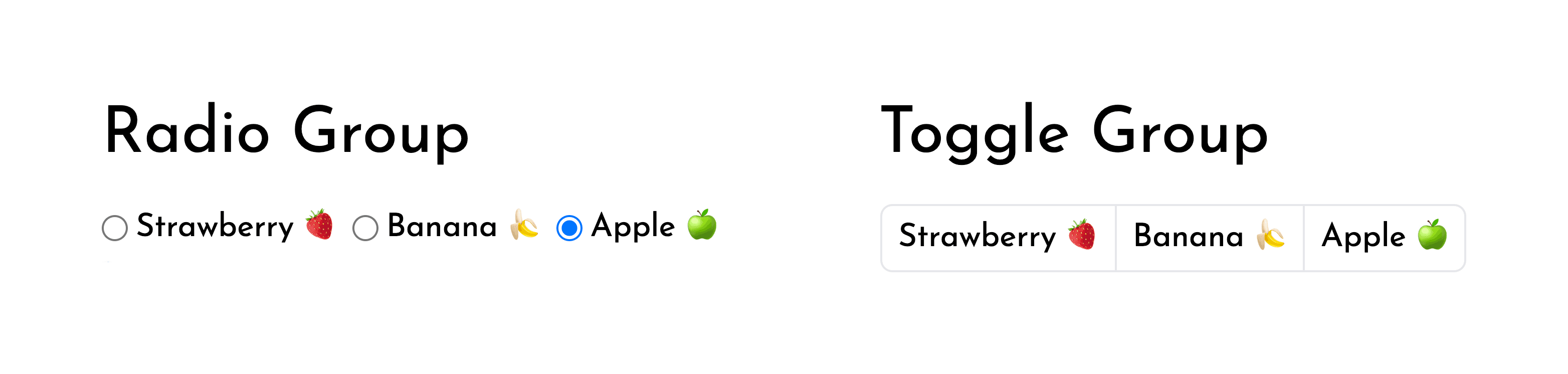
At first glance, the toggle group is just buttons smooshed together. But making those buttons keyboard accessible following the radio group ARIA pattern is the tricky part.
In this post, we will
- create a component API with basic mouse interactivity
- introduce and implement a roving
tabindexwith keyboard shortcuts - and cap it all off by talking through the ARIA guidelines.
Here's what we are making:
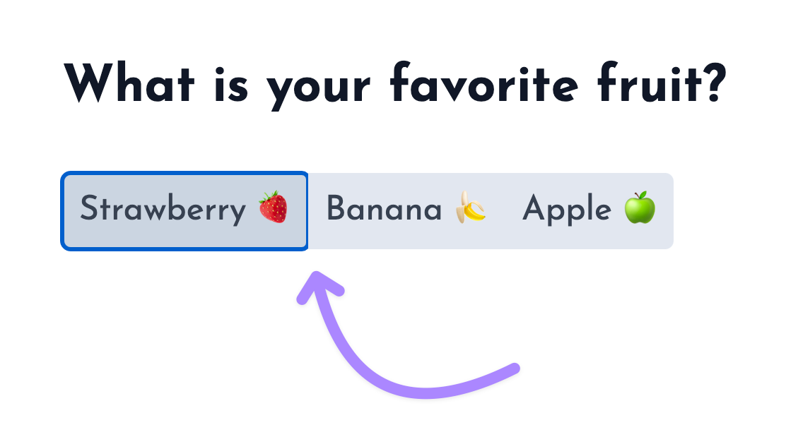
import { useState } from "react";

import { ToggleGroup } from "./toggle-group"

export default function App() {
    const [favoriteFruit, changeFavoriteFruit] = useState<string | null>("banana")

    return (
        <div className="flex h-screen justify-center items-center">
            <ToggleGroup.Root
                value={favoriteFruit}
                onChange={changeFavoriteFruit}
                aria-label="What is your favorite fruit?"
            >
                <ToggleGroup.Button value="strawberry" className="px-2">
                    Strawberry 🍓
                </ToggleGroup.Button>
                <ToggleGroup.Button value="banana" className="px-2">
                    Banana 🍌
                </ToggleGroup.Button>
                <ToggleGroup.Button value="apple" className="px-2">
                    Apple 🍏
                </ToggleGroup.Button>
            </ToggleGroup.Root>
        </div>
    )
}
Component API
The toggle group is a visual variant of the radio group pattern.
It is a great single-click alternative to the combobox and should be used when there are few enough selectable options.
I'll be making it a controlled component so that it can be used in forms and toolbars.
The API should be composable with other primitives from my UI kit, so I'll break it down into Root and Button sub-components.
We are creating a ToggleGroup like the first option:
<Root
    value={favoriteFruit}
    onChange={changeFavoriteFruit}
    aria-label="What is your favorite?"
>
    <Button value="one" className="px-2">
        Strawberry 🍓
    </Button>
    <Button value="two" className="px-2">
        Banana 🍌
    </Button>
    <Button value="three" className="px-2">
        Apple 🍏
    </Button>
</Root><ToggleGroup
value={favoriteFruit}
onChange={changeFavoriteFruit}
options={[
{
value: 'strawberry',
label: 'Strawberry 🍓'
},
{
value: 'banana',
label: 'Banana 🍌'
},
{
value: 'apple',
label: 'Apple 🍏'
},
]}
buttonClassName="px-2"
aria-label="What is your favorite?"
/>There is nothing wrong with the second API option, but it's not composable.
Imagine someone was trying to use our ToggleGroup with icon buttons.
Now they have to extend it to take an aria-label in the options array.
We can avoid problems like this one by keeping our API open.
Creating the Root component
Our Root component doesn't hold the state of our input but it will pass it along nicely with context.
const ToggleGroupContext = createContext<{
  value: string | null
  onChange: (value: string) => void
}>({
  value: null,
  onChange: () => {},
})
With context created, we can make the Root component render the context provider and spread all other props onto the <div /> that is wrapping our children.
type RootBaseProps = {
  children: ReactNode | ReactNode[]
  value: string | null
  onChange: (value: string) => void
}

type RootProps = RootBaseProps &
  Omit<ComponentPropsWithoutRef<'div'>, keyof RootBaseProps>

export function Root({ value, onChange, children, ...props }: RootProps) {
  const providerValue = useMemo(
    () => ({
      value,
      onChange,
    }),
    [value, onChange],
  )
  return (
    <ToggleGroupContext.Provider value={providerValue}>
      <div {...props}>{children}</div>
    </ToggleGroupContext.Provider>
  )
}
ComponentPropsWithoutRef is a generic TS type that ship with React.
ComponentPropsWithoutRef<'div'> represents all the props that a <div /> expects.
It is great for typing components where the props are spread onto an element.
If you redefine any of keys from ComponentPropsWithoutRef you might get a type mismatch.
To work around this I am Omiting the keys of RootBaseProps from ComponentPropsWithoutRef before creating the intersection type.
For more info on ComponentPropsWithoutRef I found this blog post helpful ↗
Creating the Button component
Ok onto the Button — the consumer of our context.
type ToggleGroupButtonBaseProps = {
  className?: string
  value: string
  children: ReactNode
}

type ToggleGroupButtonProps = ToggleGroupButtonBaseProps &
  Omit<ComponentPropsWithoutRef<'button'>, keyof ToggleGroupButtonBaseProps>

export function Button({
  children,
  value,
  className,
  ...props
}: ToggleGroupButtonProps) {
  const { value: selectedValue, onChange } = useContext(ToggleGroupContext)

  return (
    <button
      className={clsx(
        className,
        'bg-slate-200 p-1 first:rounded-l last:rounded-r hover:bg-slate-300 outline-none border-2 border-transparent focus:border-slate-400',
        selectedValue === value && 'bg-slate-300',
      )}
      onClick={e => {
        onChange(value)
        props.onClick?.(e)
      }}
    >
      {children}
    </button>
  )
}-
We use the
BaseProps+ComponentPropsWithoutReftype combo to type our component like a<button />.type ToggleGroupButtonBaseProps = { className?: string value: string children: ReactNode } type ToggleGroupButtonProps = ToggleGroupButtonBaseProps & Omit<ComponentPropsWithoutRef<'button'>, keyof ToggleGroupButtonBaseProps> -
We then consume the context for the
selectedValueandonChange.const { value: selectedValue, onChange } = useContext(ToggleGroupContext) -
We add some styles.
bg-slate-200 p-1for base background color and paddingfirst:rounded-l last:rounded-rto round the first and last<button />shover:bg-slate-300to add a hover stateselectedValue === value && 'bg-slate-300'to add a selected state
-
We disabled the default focus in favor of a border alternative
outline-none border-2 border-transparent focus:border-slate-400.I mainly did this because the elements are adjacent to each other, which causes some outline clipping.
Note: I set a border width (
border-2) and make it transparent (border-transparent) so that there is no resizing when the element is focused. -
And finally we add an event handler for
onClickof eachButtonto trigger theonChangeof ourToggleGroup.onClick={(e) => { onChange(value) }}
Just like that — our ToggleGroup works with the mouse.
import { useState } from "react";

import { ToggleGroup } from "./toggle-group"

export default function App() {
    const [favoriteFruit, changeFavoriteFruit] = useState<string | null>("banana")

    return (
        <div className="flex h-screen justify-center items-center">
            <ToggleGroup.Root
                value={favoriteFruit}
                onChange={changeFavoriteFruit}
                aria-label="What is your favorite fruit?"
            >
                <ToggleGroup.Button value="strawberry" className="px-2">
                    Strawberry 🍓
                </ToggleGroup.Button>
                <ToggleGroup.Button value="banana" className="px-2">
                    Banana 🍌
                </ToggleGroup.Button>
                <ToggleGroup.Button value="apple" className="px-2">
                    Apple 🍏
                </ToggleGroup.Button>
            </ToggleGroup.Root>
        </div>
    )
}
Keyboard shortcut concepts
Before we jump into implementing our keyboard shortcuts, I want to pose some questions that will ensure we are on the same page.
What are the different selection types?
-
The first type of selection is "selection follows focus":
As the user traverses the toggle group focus and selection move together.
-
The other type of selection is distinct from focus:
Focus is controlled with arrows (and other keys based on what pattern you are following), and selection is controlled with
space.
What ARIA pattern does the ToggleGroup follow?
The toggle group follows the radio group pattern, which means that — aside from usage within a toolbar — its selection follows focus.
Don't be confused by incorrect implementations out there. I didn't end up finding a correct one :P
- The Radix toggle group has distinct focus/selection regardless of whether it is in a toolbar or not.
- The Ant Design toggle group has selection follow focus on arrow key, but also allows you to jump between different toggle groups without using
tab. - and Material UI's toggle group just treats the component as a group of
<button/>s.
What shortcuts will we be implementing?
These are coming straight from the documentation of the radio group pattern.
up/leftarrows should move focus/selection to theprevious buttondown/rightarrows should move focus/selection to thenext buttonspaceshould select the focused element if it isn't already selectedtab/shift+tabshould select the first value unless a value is already specified
Keyboard shortcut implementation
To create keyboard shortcuts for next button and previous button we need to know the order our buttons are rendered.
If we had chosen API option two with an options prop like this -> options=[{value: 'strawberry', label: 'Strawberry 🍓'}, ...], then we would have such an order.
Instead, we will have to get this data from the DOM. If we know the order of elements in the DOM and which values correspond to each element, we can derive the order of values.
We will accomplish this by
- creating a map of values to elements
- getting the order of elements in the DOM
- and sorting a list of values based on the element order.
Creating a map of values to elements
The first step is associating DOM elements with values in our toggle group.
export function ToggleGroup({ value, onChange, children, ...props }: ToggleGroupProps) {
+    const elements = useRef<Map<string, HTMLElement>>(new Map())
    const providerValue = useMemo(
        () => ({
            value,
            onChange,
+            register: function (value: string, element: HTMLElement) {
+                elements.current.set(value, element)
+            },
+            deregister: function (value: string) {
+                elements.current.delete(value)
+            },
        }),
        [value, onChange],
    )
    return (
        <ToggleGroupContext.Provider value={providerValue}>
            <div {...props}>{children}</div>
        </ToggleGroupContext.Provider>
    )
}-
We create a mapping of value to element
const elements = useRef<Map<string, HTMLElement>>(new Map())This state is only used in event handlers and shouldn't cause rerenders so
useRefis perfect. -
We create some callbacks for the
Buttons to register with theirRootregister: function (value: string, element: HTMLElement) { elements.current.set(value, element) }, deregister: function (value: string) { elements.current.delete(value) }, -
And then in our
Buttoncomponent we use a callback ref to update the mapping<button + ref={(element: HTMLElement | null) => { + element != null ? register(value, element) : deregister(value) + }} {/* ... */} >Since callback refs are called with
nullbetween value changes, this code willderegisterbefore it reregisters again with a new element.
Getting the order of elements and sorting our list of values
When reading Radix's implementation of a roving tabindex I found that they query based on a data attribute.
I'll be adding a similar data attribute to the Button.
<button
+    data-toggle-group-button
>
Now I can query the ref of the wrapper element in my Root for that data attribute.
export function ToggleGroup({ value, onChange, children, ...props }: ToggleGroupProps) {
    const elements = useRef<Map<string, HTMLElement>>(new Map())
+    const ref = useRef<HTMLDivElement | null>(null)

+    const getOrderedItems = useCallback(() => {
+        if (!ref.current) return []

        // query DOM elements by the data attribute from the `Root`
+        const domElements = Array.from(ref.current.querySelectorAll('[data-toggle-group-button]'))

        // sort an array of {value, element} pairs (Items)
+        return Array.from(elements.current)
+            .sort((a, b) => domElements.indexOf(a[1]) - domElements.indexOf(b[1]))
+            .map(([value, element]) => ({ value, element }))
+    }, [])

    const providerValue = useMemo(
        () => ({
+           getOrderedItems
        }),
-        [value, onChange],
+        [value, onChange, getOrderedItems],
    )
    return (
        <ToggleGroupContext.Provider value={providerValue}>
-            <div {...props}>
+            <div ref={ref} {...props}>
                {children}
            </div>
        </ToggleGroupContext.Provider>
    )
}-
We create a new callback for getting an ordered list of items
const getOrderedItems = useCallback(() => { /* ... */ }, [])Items here is what I am referring to an object with a value and it's related element.type Item = { value: string; element: HTMLElement } -
In that callback we can query the
Buttons within ourRootconst domElements = Array.from( ref.current.querySelectorAll('[data-toggle-group-button]'), ) -
And then derive the order of
Items from the order of elements in the DOM.return Array.from(elements.current) .sort((a, b) => domElements.indexOf(a[1]) - domElements.indexOf(b[1])) .map(([value, element]) => ({ value, element }))
Creating the next button keyboard shortcut
Jumping back into the Button I can now add an onKeyDown event handler to trigger navigation.
function Button(/* ... */) {
    const {
+        getOrderedItems,
    } = useContext(ToggleGroupContext)

    return (
        <button
+            onKeyDown={(e) => {
+                const items = getOrderedItems()
+                let nextItem: Item | undefined
+                const currIndex = items.findIndex(item => item.value === value)
+
+                if (currIndex === -1) {
+                    nextItem = items.shift()
+                } else if (isHotkey(['down', 'right'], e)) {
+                    nextItem = currIndex === items.length - 1 ? items[0] : items[currIndex + 1]
+                }
+
+                if (nextItem) {
+                    nextItem.element.focus()
+                    onChange(nextItem.value)
+                }
+            }}
        >
{/* ... */}-
We get the list of ordered
Itemsconst items = getOrderedItems() -
Create a variable to hold the
nextItemthat will be focused/selectedlet nextItem: Item | undefined -
Find the index of the currently focused item
const currIndex = items.findIndex(item => item.value === value) -
If it doesn't exist, set
nextItemto be the first item in our ordered listif (currIndex === -1) { nextItem = items.shift() } -
In the case of
rightordownkeys, setnextItemto be the item positioned atcurrIndex + 1else if { nextItem = currIndex === items.length - 1 ? items[0] : items[currIndex + 1] } -
Now we can check if
nextItemwas set. If it was,focusthe related element andonChangewith the related valueif (nextItem) { nextItem.element.focus() onChange(nextItem.value) }
Creating the previous button keyboard shortcut
With the next button shortcut in place adding in previous button is quite easy.
if (currIndex === -1) {
  nextItem = items.shift()
} else if (isHotkey(['down', 'right'], e)) {
nextItem = currIndex === items.length - 1 ? items[0] : items[currIndex + 1]
- }
+ } else if (isHotkey(['up', 'left'], e)) {
+ nextItem = currIndex === 0 ? items[items.length - 1] : items[currIndex - 1]
+ }Composing keyboard events
Let's also handle any event handlers passed to our Root and Button components.
A prop interface is like a contract that the component offers.
Since we used ComponentPropsWithoutRef, it's important to compose the event handlers and keep our side of the bargain.
onClick={(e ) => {
+    props.onClick?.(e)
   /* ... */
}}
onKeyDown={(e) => {
+   props.onKeyDown?.(e)
   /* ... */
}}
This will ensure that if someone wants to trigger an event on a specific Button like so:
<Root
  value={favoriteFruit}
  onChange={changeFavoriteFruit}
  aria-label="What is your favorite?"
>
  <Button onClick={() => throwBanana()} value="two" className="px-2">
    Banana 🍌
  </Button>
  {/* ... */}
</Root>
they won't run into any surprises.
Preventing scroll on up and down arrows
One final thing we need to do is prevent the default scroll on the up and down keys. preventDefault is perfect for doing just that.
    <button
        onKeyDown={(e) => {
            props.onKeyDown?.(e)
+            if (isHotkey(['up', 'down'])) {
+                e.preventDefault()
+            }
            const items = getOrderedItems()
            let nextItem: Item | undefined

            /* ... */
Here is a look at our component so far:
import { useState } from "react";

import { ToggleGroup } from "./toggle-group"

export default function App() {
    const [favoriteFruit, changeFavoriteFruit] = useState<string | null>("banana")

    return (
        <div className="flex flex-col space-y-10 h-screen justify-center items-center">
            <button className="text-white bg-[rgb(171,135,255)] px-2 py-1 rounded-md">focusable element</button>
            <ToggleGroup.Root
                value={favoriteFruit}
                onChange={changeFavoriteFruit}
                aria-label="What is your favorite fruit?"
            >
                <ToggleGroup.Button value="strawberry" className="px-2">
                    Strawberry 🍓
                </ToggleGroup.Button>
                <ToggleGroup.Button value="banana" className="px-2">
                    Banana 🍌
                </ToggleGroup.Button>
                <ToggleGroup.Button value="apple" className="px-2">
                    Apple 🍏
                </ToggleGroup.Button>
            </ToggleGroup.Root>
            <button className="text-white bg-[rgb(171,135,255)] px-2 py-1 rounded-md">focusable element</button>
        </div>
    )
}
Despite being able to move the selection with the arrow keys, our toggle group isn't behaving as one unit yet.
If Strawberry is focused — and I hit tab — the focus should move through the other buttons and to the next interactive element.
A roving tabindex will help us accomplish that behavior.
Roving tabindex concepts
Before we jump into implementation let's cover some basics.
What is a tabindex?
- A
tabindexis a HTML attribute that allows you to control whether something is focusable or not. - A
tabindexof0means that this element should appear in the normal tab order. - A
tabindexof-1means that this element shouldn't be in the tab order. - A
tabindexof greater than0allows you to manually set the tab order. (this is considered bad practice)
What is a roving tabindex?
A roving tabindex is a technique for controlling focus.
In a native radio group, your selection and focus are saved as you tab to and from the component.
With keyboard shortcuts alone we still don't get this type of experience in our toggle group.
When Apple 🍏 is selected, shift+tab moves back to Banana 🍌 — the previous element in the tab order.
We need a solution that takes elements out of the tab order so that no extra tabbing is needed.
We need a solution that toggles tabindex from -1 to 0 and back again based on whether the element is currently focused.
This kind of focus control is called a roving tabindex.
Roving tabindex implementation
I'll be implementing this roving tabindex in three stages
- Tracking and toggling
tabindex - Handling
tabwhen initialvalueisnull - Handling
shift+tabwhenRootis focusable
Tracking and toggling tabindex
Let's create some state for which value is focused in our Root component and pass it via context.
function Root({ value, onChange, children, ...props }: RootProps) {
+    const [focusedValue, setFocusedValue] = useState<string | null>(value)

    const providerValue = useMemo(
        () => ({
+            setFocusedValue: function (id: string) {
+                setFocusedValue(id)
+            },
+            focusedValue,
        }),
-        [getOrderedItems, onChange, value],
+        [focusedValue, getOrderedItems, onChange, value],
    )
I could pass along the setter from useState, but I am wrapping it to simplify the type of setFocusedValue in my context.
The fact that I'm using useState is an implementation detail that I don't want as part of the contract between the Root and my Buttons.
Back in our Button:
function Button({ children, value, className, ...props }: ToggleGroupButtonProps) {
    const {
        /* ... */
+        focusedValue,
+        setFocusedValue,
    } = useContext(ToggleGroupContext)

    return (
        <button
+            tabIndex={focusedValue === value ? 0 : -1}
            onClick={(e) => {
+                e.currentTarget.focus()
                onChange(value)
            }}
+            onFocus={(e) => {
+                setFocusedValue(value)
+            }}
            {/* ... */}
        >
            {children}
        </button>
    )
}-
We create an
onFocusto update thefocusedValueonFocus={(e) => { setFocusedValue(value) }} -
We toggle
tabindexbased on whether thisButton's value is currently focusedtabIndex={focusedValue === value ? 0 : -1} -
Finally, since Safari doesn't trigger focus
onClickwe can force this interaction by.focus()ing thecurrentTarget.e.currentTarget.focus()
Handling tab when initial value is null
Our implementation has an edge case. If the initial value of our toggle group is null then no Buttons are focusable.
According to our spec, when the value is null and our component receives focus the first element should be focused.
Let's make our Root focusable (tabindex={0}), and its onFocus can pass focus to the first Button.
function Root({ value, onChange, children, ...props }: RootProps) {
    /* ... */
    return (
        <ToggleGroupContext.Provider value={providerValue}>
            <div
                tabIndex={0}
+                onFocus={() => {
+                    if (e.target !== e.currentTarget) return
+                    const orderedItems = getOrderedItems()
+
+                    if (value) {
+                        elements.current.get(value)?.focus()
+                    } else {
+                        orderedItems.at(0)?.element.focus()
+                    }
+                }}
                ref={ref}
                {...props}
            >
                {children}
            </div>
        </ToggleGroupContext.Provider>
    )
}-
First we check that the focus is coming from the wrapper element — not one of its children.
if (e.target !== e.currentTarget) returnThis means that we don't run this logic on
focusevents that bubble up from ourButton. We could alsoe.stopPropagationin ourButtonbut that is much more intrusive than just checking the source where we need it. -
We then reuse the
getOrderedItemsto easily find the first element in the list -
If the toggle group has value set - focus the related element
if (value) { elements.current.get(value)?.focus() } -
Otherwise focus the first element
else {
    orderedItems.at(0)?.element.focus()
}
Handling shift+tab when Root is focusable
Unfortunately, making the Root focusable breaks shift+tab.
That's because our Root element receives focus and places it back on the child.
We can fix this by toggling the tabindex of our Root between the onKeyDown of our Button and the onBlur of our Root
-
In the
Rootwe can create some state for representing when the user pressesshift+tabfunction Root({ value, onChange, children, ...props }: RootProps) { + const [isShiftTabbing, setIsShiftTabbing] = useState(false) const providerValue = useMemo( () => ({ + onShiftTab: function () { + setIsShiftTabbing(true) + }, }), [/*...*/], ) -
This state can then toggle the
Rootout of the tab orderreturn ( <ToggleGroupContext.Provider value={providerValue}> <div - tabIndex={0} + tabIndex={isShiftTabbing ? -1 : 0} > } -
In our
Buttonwe can then set this value in theonKeyDownofshift+tabreturn ( <button onKeyDown={(e) => { + if (isHotkey('shift+tab', e)) { + onShiftTab() + } /* ... */ -
This toggles our
tabIndexvalue to-1in theRoot, and our focus leaves theToggleGroupall together -
The
onBlurof ourButtonoccurs, bubbles up to theRoot, and there we can reset ourRoot'stabIndexstatereturn ( <ToggleGroupContext.Provider value={providerValue}> <div tabIndex={isShiftTabbing ? -1 : 0} + onBlur={() => setIsShiftTabbing(false)} > }
With that — we have a roving tabindex 🛻💨
import { useState } from "react";

import { ToggleGroup } from "./toggle-group"

export default function App() {
    const [favoriteFruit, changeFavoriteFruit] = useState<string | null>("banana")

    return (
        <div className="flex flex-col space-y-10 h-screen justify-center items-center">
            <button className="text-white bg-[rgb(171,135,255)] px-2 py-1 rounded-md">focusable element</button>
            <ToggleGroup.Root
                value={favoriteFruit}
                onChange={changeFavoriteFruit}
                aria-label="What is your favorite fruit?"
            >
                <ToggleGroup.Button value="strawberry" className="px-2">
                    Strawberry 🍓
                </ToggleGroup.Button>
                <ToggleGroup.Button value="banana" className="px-2">
                    Banana 🍌
                </ToggleGroup.Button>
                <ToggleGroup.Button value="apple" className="px-2">
                    Apple 🍏
                </ToggleGroup.Button>
            </ToggleGroup.Root>
            <button className="text-white bg-[rgb(171,135,255)] px-2 py-1 rounded-md">focusable element</button>
        </div>
    )
}
Aria attributes
The pattern for this component is already well defined. I recommend reading it yourself if you are implementing this component, but in the following two sections, I'll detail the changes required to make our component accessible.
Root
The Root needs a role="radiogroup".
    return (
        <ToggleGroupContext.Provider value={providerValue}>
            <div
+               role="radiogroup"
And we also need a way to enforce either a aria-label or aria-labelledby.
+   type PropsWithLabelBy = {
+       ['aria-labelledby']: string
+   }

+    type PropsWithLabel = {
+        ['aria-label']: string
+    }

-    type RootProps =
+    type RootProps = (PropsWithLabel | PropsWithLabelBy) &
        RootBaseProps &
Omit<ComponentPropsWithoutRef<'div'>, keyof RootBaseProps>- I created a
Union (|)type of two different methods of labeling aradiogroup - I then created an
Intersection (&)type of our label props with our existing props
This will alert the developer that they haven't specified an aria-label or an aria-labeledby.
Button
For the Button, we can add the correct role="radio" and an aria-checked with the selectedValue from context.
return (
    <button
+        role="radio"
+        aria-checked={selectedValue === value}
These properties provide context for all users to navigate our component. Here is one last look:
import { useState } from "react";

import { ToggleGroup } from "./toggle-group"

export default function App() {
    const [favoriteFruit, changeFavoriteFruit] = useState<string | null>("banana")

    return (
        <div className="flex h-screen justify-center items-center">
            <ToggleGroup.Root
                value={favoriteFruit}
                onChange={changeFavoriteFruit}
                aria-label="What is your favorite fruit?"
            >
                <ToggleGroup.Button value="strawberry" className="px-2">
                    Strawberry 🍓
                </ToggleGroup.Button>
                <ToggleGroup.Button value="banana" className="px-2">
                    Banana 🍌
                </ToggleGroup.Button>
                <ToggleGroup.Button value="apple" className="px-2">
                    Apple 🍏
                </ToggleGroup.Button>
            </ToggleGroup.Root>
        </div>
    )
}
That's a wrap on this component. But there is a bunch more to come ⚡
I still have a lot to learn about components and my plan for this year is to learn and document as much about React components as I can. The "hub" for that work can be found here and more examples of this component can be found here.
Links
- Component source
- More details on managing focus in composite widgets
- I got a ton of inspo for my roving
tabindexfrom the Radix source. Shout out to their team.