At Makeswift we recently released a new pricing model and with it, a new slider component. Along the way, I learned a thing or two about drag and drop from Alan, which is what I will be sharing below.
In this post, I’ll explain the complexities of a slider component that mimics native behavior with keyboard accessibility and resizability.
Here is what we are making:
import { useState } from "react";
import { Circle, Square, Triangle } from "./shapes";
import { Slider } from "./slider";

export default function Home() {
  const [state, setState] = useState<number>(0);

  return (
    <div className="px-10">
      <Slider
        className="w-full max-w-3xl mx-auto mt-5"
        stops={[
          <Square className="fill-[#AB87FF]" />,
          <Circle className="fill-[#446DF6]" />,
          <Triangle className="fill-[#FBB02D]" />,
          <Square className="fill-[#ACECA1]" />,
          <Circle className="fill-[#FFFF4C]" />,
          <Square className="fill-[#FE65B7]" />,
        ]}
        value={state}
        onChange={(value: number) => setState(value)}
      />
    </div>
  );
}
Component API
A slider is an enhanced <input type="range" /> component.
So for the API I wanted to use value and onChange so that
- it is ready to use as a controlled input
- it is swappable with native inputs
Additionally, there is also a stops prop, which is of type ReactNode[] in our example.
This is incidental. I wanted to show basic shapes as the stop labels, and in most apps the type would probably be something like
type Stop = {
    label: string
    value: string
    /* ... */
}
Our Slider in use looks something like:
<Slider
    value={state}
    onChange={(value: number) => setState(value)}
    stops={[
        <Square className="fill-purple" />,
        <Circle className="fill-blue" />,
        <Triangle className="fill-orange" />,
        <Square className="fill-green" />,
        <Circle className="fill-yellow" />,
        <Square className="fill-pink" />,
    ]}
    className="w-full max-w-3xl mx-auto mt-5"
/>
Internal structure
The internal structure of our slider is comprised of three divs: container, track, and thumb.
<div
    className={classNames(
        'relative z-0 w-full flex justify-center items-center touch-none',
    )}
>
    <div /> {/* <- track */}
    <div /> {/* <- thumb */}
</div>
The track is the background of our slider component. It renders stops and handles onClick events.
The thumb is the circle that slides along as the value changes. It renders the current value and handles onPointerMove events.
The names track and thumb come from the ids on the divs that are used in the shadow dom implementation of the <input type="range" />
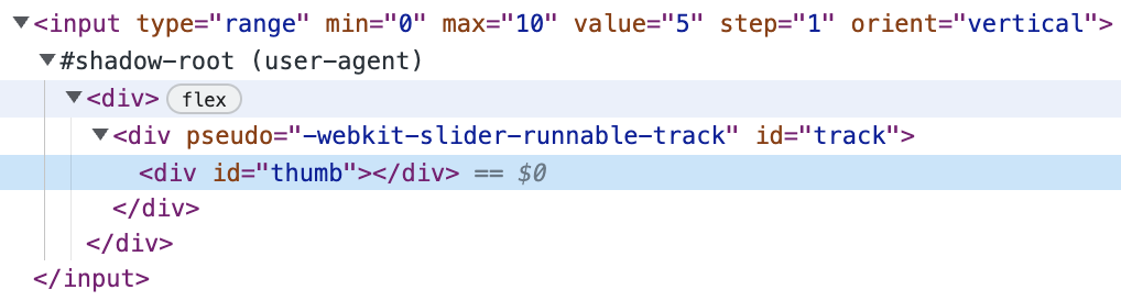
To see for yourself enable the shadow dom like so:
And inspect this <input type="range" />
A draggable thumb
The slider component we are creating is going to mimic a controlled input, where value and onChange are used to hold state externally.
While value is external, we will be using a piece of internal derived state for the x position of the thumb.
This x position should reflect changes to our value by transforming the thumb along our track.
Updating value based on user input
<motion.div
    onPointerDown={e => {
        const { ownerDocument } = e.currentTarget

        function onPointerMove(e: PointerEvent) {
            if (!container.current) return

            const { width: containerWidth, left: containerLeft } =
                container.current.getBoundingClientRect()

            const segmentWidth = containerWidth / (stops.length - 1)
            const index = Math.round((e.clientX - containerLeft) / segmentWidth)
            const clampedIndex = clamp(index, 0, stops.length - 1)
            onChange(clampedIndex)
        }

        function onPointerUp(e: PointerEvent) {
            ownerDocument.removeEventListener('pointermove', onPointerMove)
        }

        ownerDocument.addEventListener('pointermove', onPointerMove)
        ownerDocument.addEventListener('pointerup', onPointerUp)
    }}
/>
In the onPointerMove we
- Get the width of the container
container.current.getBoundingClientRect();
- Divide that into segments based on the number of stops
const segmentWidth = containerWidth / (stops.length - 1);
- Find the closest index to the current mouse position
const index = Math.round((e.clientX - containerLeft) / segmentWidth)
- Clamp that index the min and max values allowed
const clampedIndex = clamp(index, 0, stops.length - 1);
- And update the
valueto reflect the changeonChange(clampedIndex);
onPointerUp then cleans up the pointermove event listener.
This pattern of setting move/up listeners in the down handler was new to me and is something to keep in mind when looking through DnD libraries.
Thanks Alan for walking me through it!
Syncing position with value
Ok so our value is updating, but the thumb is still not moving. Let's
1 - Create state to hold thumb position
const [position, setPosition] = useState(0)2 - Create an effect that sets thumb position on first render
useEffect(() => {
    if (!container.current) return
    const { width: containerWidth } = container.current.getBoundingClientRect()
    const segmentWidth = containerWidth / (stops.length - 1)
    setPosition(value * segmentWidth)
}, [])

/* ... */

position != null && <motion.div /* */ />-
setPosition(value * segmentWidth);- With the segment derived from the container and number of stops we can set
positionby multiplyingvalueandsegementWidth
- With the segment derived from the container and number of stops we can set
-
position != null- Then we can conditionally render our
thumbto appear on render #2 once the effect has initializedposition
- Then we can conditionally render our
3 - Update our onPointerMove to keep position in sync with value
function onPointerMove(e:PointerEvent) {
+   setPosition(clampedIndex * segmentWidth);
    onChange(clampedIndex);
}
and 4 - Animate the thumb based on the position
<motion.div
    /* ... */
    className={classNames(
        'z-10 absolute left-0 top-1/2 w-7 h-7 sm:w-8 sm:h-8 rounded-full border-medium hover:border-dark border-2 shadow-[0px 4px 12px 0px #AB87FF1A] bg-white select-none cursor-ew-resize outline-offset-8 transition-colors',
    )}
    initial={false}
    animate={{
        x: position - 14,
        y: '-50%',
    }}
    /* ... */
/>
absolute left-0 top-1/2+y:-50%- Here we are absolutely positioning the thumb left aligned and vertically centered
- Framer Motion uses inline styles that override CSS classes, so we are setting
y:-50%in theanimateprop to avoid losing our vertical center on first animation.
x: position - 14- We transform the thumb along the track offsetting it by -14 (1/2 of the 28px width) to horizontally center it on top of the current stop.
A clickable track
Now that we have the thumb interaction, let's work on rendering the track behind it.
<div
    className={classNames('w-full py-3 flex gap-1 cursor-pointer')}
    onClick={e => {
        /* same logic as the `onPointerMove` from above */
    }}
>
    {Array.from({ length: stops.length - 1 }).map((stop, i) => (
        <div
            key={i}
            className={classNames('flex-1 h-2 sm:h-3 bg-[#efefef] w-2', {
                'rounded-l-md': i === 0,
                'rounded-r-md': i === stops.length - 2,
            })}
        />
    ))}
</div>
The onClick is a copy of the onPointerMove. They are both taking the e.clientX and mapping it to value.
Your mileage with this section will vary based on your design, but for my design I
- Create a new array that represents the segments between stops
Array.from({ length: stops.length - 1 })
- And map through it to render a background color
Styling touches
At this point our slider is working, but we don't have a way to set styles on drag. Enter isDragging
+ const [isDragging, setIsDragging] = useState(false);

/* ... */

onPointerDown={(e) => {
+   setIsDragging(true);


    function onPointerUp(e: PointerEvent) {
+        setIsDragging(false);
    }
}}
We can use this state to
- Set the resize cursor on the container
<div className={classNames({["cursor-ew-resize"]: isDragging })} />
- Set the border color on the thumb
<div className={classNames({["border-purple hover:border-purple"]: isDragging })} />- Note: I am setting the border for the
hoverstate so that tailwind overrides thehover:border-mediumthat is already in place.
Keyboard shortcuts
At this point we still can't focus our input or use any keyboard shortcuts we would expect from a <input type="range" />. Let's fix that!
Focusablility
Our slider is composed entirely of divs, so to make it focusabled we need to add a tab index.
<motion.div tabIndex={0} />Adding the actual shortcuts
For this I am deffering to the react binding of hotkeys-js, react-hotkeys-hook
useHotkeys(
    'left,down',
    () => {
        if (!container.current) return
        const { width: containerWidth } =
            container.current.getBoundingClientRect()
        const segmentWidth = containerWidth / (stops.length - 1)
        const nextIndex = clamp(value - 1, 0, stops.length - 1)
        setPosition(nextIndex * segmentWidth)
        onChange(nextIndex)
    },
    {},
    [value],
)
This is similar to the onPointerMove aside from this line.
- const index = Math.round((e.clientX - containerLeft) / segmentWidth);
- const clampedIndex = clamp(index, 0, stops.length - 1);

+ const nextIndex = clamp(value - 1, 0, stops.length - 1);
When someone uses the left hotkey we can decrement the value, and conversely when they use the right hotkey increment it.
+ const nextIndex = clamp(value + 1, 0, stops.length - 1);Keyboard styles
Now to match the mouse styles we can set isDragging on focus and blur.
onFocus={() => setIsDragging(true)}
onBlur={() => setIsDragging(false)}
Resizability
The final part of our demo is adding a resize observer so that when the size of the browser changes our thumb position gets updated.
I am using a useEffect to set an event listener for the resize event.
useEffect(() => {
    window.addEventListener('resize', listener)

    return () => window.removeEventListener('resize', listener)

    function listener() {
        if (!container.current) return

        const { width: containerWidth } =
            container.current.getBoundingClientRect()
        const segmentWidth = containerWidth / (stops.length - 1)
        setPosition(value * segmentWidth)
    }
}, [value])
When cleanup is necessary in a useEffect I have tended to enjoy this "add, remove, and then define" pattern.
Haven't seen it all over the place, but I think it makes reading useEffects a bit easier.
This post is a part of a series I am writing on animated and accessible components. (details here)
But that's all for this example. Hope it was helpful! If you still are confused HMU with any feedback you have at the email in the footer :)
Links
- Component Demo
- Component Github
- Other Components I have written about
- Video to similar topic
- Sam Selikoff is such a great instructor. I haven't even had time to watch this video but I know it will be :chef's kiss: